Featured Articles
-

 21NHL Game Previews, Picks & Predictions
Golden Knights vs Stars Prediction, Pick, Preview & Betting Odds for 4/24/24
-

 32MLB Game Previews, Picks & Predictions
Orioles vs Angels Prediction, Pick, Preview & Betting Odds – MLB 4/24/24
-

 26NBA Game Previews, Picks & Predictions
Heat vs Celtics Prediction, Pick, Preview & Betting Odds for 4/24/24
What’s Hot
-

 22NHL Game Previews, Picks & Predictions
Bruins vs Maple Leafs Prediction, Pick, Preview & Betting Odds for 4/24/24
Read our Bruins vs Maple Leafs prediction for this NHL regular season game in...
-

 31MLB Game Previews, Picks & Predictions
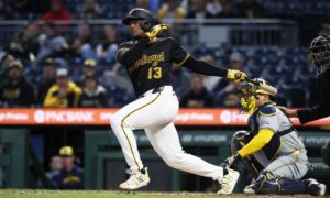
Brewers vs Pirates Prediction, Pick, Preview & Betting Odds – MLB 4/24/24
Check out our free Brewers vs Pirates pick and preview for this MLB matchup...
-

 32MLB Game Previews, Picks & Predictions
Diamondbacks vs Cardinals Prediction, Pick, Preview & Betting Odds – MLB 4/24/24
Check out our free Diamondbacks vs Cardinals pick and preview for this MLB matchup...
Latest Knup Sports Show
Latest Posts at KnupSports.com
-

 11MLS Game Previews, Picks & Predictions
Portland Timbers vs Los Angeles Prediction, Pick, Preview & Betting Odds – MLS 4/28/24
Check out our free Portland Timbers vs Los Angeles pick and preview for this MLS match in Los Angeles, CA. See who...
-

 18MLS Game Previews, Picks & Predictions
San Jose Earthquakes vs Nashville SC Prediction, Pick, Preview & Betting Odds – MLS 4/28/24
Check out our free San Jose Earthquakes vs Nashville SC pick and preview for this MLS match in Nashville, TN. See who...
-

 13MLS Game Previews, Picks & Predictions
Sporting Kansas City vs Minnesota United Prediction, Pick, Preview & Betting Odds – MLS 4/28/24
Check out our free Sporting Kansas City vs Minnesota United pick and preview for this MLS match in Saint Paul, MN. See...
-

 14MLS Game Previews, Picks & Predictions
Houston Dynamo vs FC Dallas Prediction, Pick, Preview & Betting Odds – MLS 4/28/24
Check out our free Houston Dynamo vs FC Dallas pick and preview for this MLS match in Frisco, TX. See who we...
-

 13MLS Game Previews, Picks & Predictions
Atlanta United vs Chicago Fire Prediction, Pick, Preview & Betting Odds – MLS 4/28/24
Check out our free Atlanta United vs Chicago Fire pick and preview for this MLS match in Chicago, IL. See who we...
-

 12MLS Game Previews, Picks & Predictions
Real Salt Lake vs Philadelphia Union Prediction, Pick, Preview & Betting Odds – MLS 4/27/24
Check out our free Real Salt Lake vs Philadelphia Union pick and preview for this MLS match in Chester, PA. See who...
-

 11MLS Game Previews, Picks & Predictions
Toronto vs Orlando City SC Prediction, Pick, Preview & Betting Odds – MLS 4/27/24
Check out our free Toronto vs Orlando City SC pick and preview for this MLS match in Orlando, FL. See who we...
-

 12MLS Game Previews, Picks & Predictions
Vancouver Whitecaps vs New York Red Bulls Prediction, Pick, Preview & Betting Odds – MLS 4/27/24
Check out our free Vancouver Whitecaps vs New York Red Bulls pick and preview for this MLS match in Harrison, NJ. See...
-

 14MLS Game Previews, Picks & Predictions
Inter Miami CF vs New England Revolution Prediction, Pick, Preview & Betting Odds – MLS 4/27/24
Check out our free Inter Miami CF vs New England Revolution pick and preview for this MLS match in Foxborough, MA. See...
-

 16MLS Game Previews, Picks & Predictions
Colorado Rapids SC vs FC Cincinnati Prediction, Pick, Preview & Betting Odds – MLS 4/27/24
Check out our free Colorado Rapids SC vs FC Cincinnati pick and preview for this MLS match in Cincinnati, OH. See who...
-

 16MLS Game Previews, Picks & Predictions
Seattle Sounders vs D.C. United SC Prediction, Pick, Preview & Betting Odds – MLS 4/27/24
Check out our free Seattle Sounders vs D.C. United SC pick and preview for this MLS match in Washington, D.C.. See who...
-

 17EPL Game Previews, Picks & Predictions
Arsenal vs Tottenham Hotspur Prediction, Pick, Preview & Betting Odds – Premier League 4/28/24
Check out our free Arsenal vs Tottenham Hotspur pick and preview for this Premier League match in London. See who we like...
-

 15EPL Game Previews, Picks & Predictions
Chelsea vs Aston Villa Prediction, Pick, Preview & Betting Odds – Premier League 4/27/24
Check out our free Chelsea vs Aston Villa pick and preview for this Premier League match in Birmingham. See who we like...
-

 16EPL Game Previews, Picks & Predictions
Manchester City vs Brighton & Hove Albion Prediction, Pick, Preview & Betting Odds – Premier League 4/25/24
Check out our free Manchester City vs Brighton & Hove Albion pick and preview for this Premier League match in Brighton &...
-

 15EPL Game Previews, Picks & Predictions
Sheffield United vs Manchester United Prediction, Pick, Preview & Betting Odds – Premier League 4/24/24
Check out our free Sheffield United vs Manchester United pick and preview for this Premier League match in Manchester. See who we...
-

 18EPL Game Previews, Picks & Predictions
Liverpool vs Everton Prediction, Pick, Preview & Betting Odds – Premier League 4/24/24
Check out our free Liverpool vs Everton pick and preview for this Premier League match in Liverpool. See who we like to...
-

 17EPL Game Previews, Picks & Predictions
Newcastle United vs Crystal Palace Prediction, Pick, Preview & Betting Odds – Premier League 4/24/24
Check out our free Newcastle United vs Crystal Palace pick and preview for this Premier League match in London. See who we...
-

 19EPL Game Previews, Picks & Predictions
AFC Bournemouth vs Wolverhampton Wanderers Prediction, Pick, Preview & Betting Odds – Premier League 4/24/24
Check out our free AFC Bournemouth vs Wolverhampton Wanderers pick and preview for this Premier League match in Wolverhampton. See who we...
-

 29NHL Game Previews, Picks & Predictions
Kings vs Oilers Prediction, Pick, Preview & Betting Odds for 4/24/24
Read on to get betting odds and prediction in our Kings vs Oilers pick and preview and see who we think will...
-

 21NHL Game Previews, Picks & Predictions
Golden Knights vs Stars Prediction, Pick, Preview & Betting Odds for 4/24/24
Read on to get betting odds and prediction in our Golden Knights vs Stars pick and preview and see who we think...


