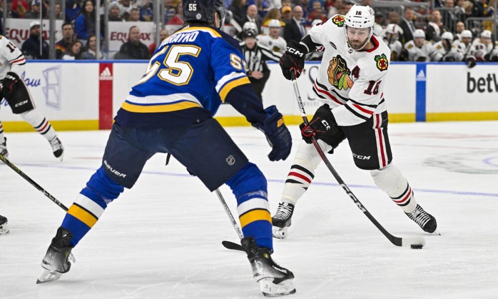
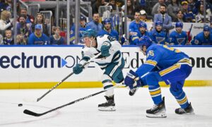
Kraken vs Wild Prediction, Pick, Preview & Betting Odds for 4/18/24
Diamondbacks vs Giants Prediction, Pick, Preview & Betting Odds – MLB 4/18/24
Marlins vs Cubs Prediction, Pick, Preview & Betting Odds – MLB 4/18/24
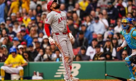
Check out our free Angels vs Rays pick and preview for this MLB matchup at Tropicana Field. See who we like to...
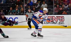
In this NHL regular season prediction between the Ducks and Golden Knights, see who...
Check out our free Guardians vs Red Sox pick and preview for this MLB...
Check out our free Rangers vs Tigers pick and preview for this MLB matchup...
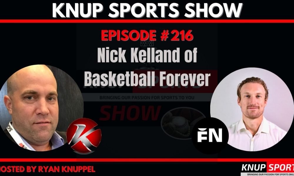
Nick Kelland of Basketball Forever joins the show to talk about how the Forever Network got it's start, plus where they are...
In this NHL regular season prediction between the Ducks and Golden Knights, see who like to win the game and cover the...
In this NHL regular season prediction between the Sharks and Flames, see who like to win the game and cover the puck...
Check out our free Canucks vs Jets prediction for this NHL matchup in Winnipeg. See who we like to win and cover...
In this NHL regular season prediction between the Kraken and Wild, see who like to win the game and cover the puck...
Check out our free Diamondbacks vs Giants pick and preview for this MLB matchup at Oracle Park. See who we like to...
Check out our free Marlins vs Cubs pick and preview for this MLB matchup at Wrigley Field. See who we like to...
Check out our free Guardians vs Red Sox pick and preview for this MLB matchup at Fenway Park. See who we like...
Check out our free Rangers vs Tigers pick and preview for this MLB matchup at Comerica Park. See who we like to...
Check out our free Manchester City vs Brighton & Hove Albion pick and preview for this Premier League match in Brighton &...
Check out our free Liverpool vs Fulham pick and preview for this Premier League match in London. See who we like to...
Check out our free West Ham United vs Crystal Palace pick and preview for this Premier League match in London. See who...
Check out our free AFC Bournemouth vs Aston Villa pick and preview for this Premier League match in Birmingham. See who we...
Check out our free Nottingham Forest vs Everton pick and preview for this Premier League match in Liverpool. See who we like...
Check out our free Arsenal vs Wolverhampton Wanderers pick and preview for this Premier League match in Wolverhampton. See who we like...
Check out our free Burnley vs Sheffield United pick and preview for this Premier League match in Sheffield, Yorkshire. See who we...
Check out our free Brentford vs Luton Town pick and preview for this Premier League match in Luton. See who we like...
Check out our free San Jose Earthquakes vs Los Angeles Galaxy pick and preview for this MLS match in Carson, CA. See...
Check out our free Minnesota United vs Charlotte pick and preview for this MLS match in Charlotte, NC. See who we like...
Check out our free Vancouver Whitecaps vs Seattle Sounders pick and preview for this MLS match in Seattle, WA. See who we...